Easy Tech Tuts
How to Generate Reports in Zendesk Easily 2026
By Impran M N
Guessing at your team's response times or ticket volume isn't a substitute for real data, and Zendesk already has the numbers sitting in your account whether you're looking at them or not. This guide shows how to move from the built-in real-time dashboards to building your own custom report in Explore — picking a dataset, choosing what to count, slicing it by an attribute like agent name, and saving the result so it can be reused. It's aimed at anyone who wants a specific answer Zendesk's default views don't already show.
01Check the real-time monitoring home first
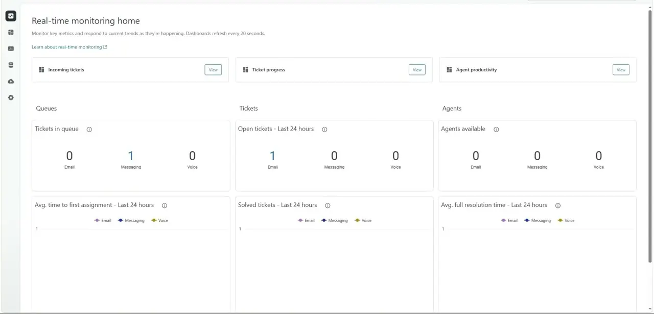
Before building anything custom, it's worth knowing what Zendesk already tracks automatically. The Real-time monitoring home groups live numbers into Queues, Tickets, and Agents columns — tickets currently in queue, open tickets in the last 24 hours, and agents available, each split by channel (Email, Messaging, Voice).
Below that sit trend charts for average time to first assignment, solved tickets, and average full resolution time, all refreshing every 20 seconds per the page's own description. If your question is a snapshot of "right now," this page often answers it without opening Explore at all.
02Open Explore and start a new report
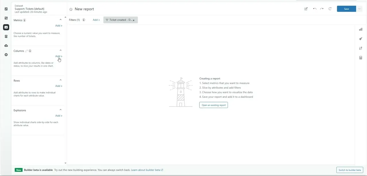
For anything beyond a live snapshot — a custom date range, a specific agent, a trend over weeks — you need Explore, the separate analytics workspace reached from the Products menu. Starting a new report drops you on an empty canvas with a dataset already selected in the top-left corner, in this case "Support: Tickets [default]," which is the right starting point for almost any ticket-volume or resolution-time question. The empty state spells out the four-step process directly: select metrics, slice by attributes and filters, choose a visualization, then save and add it to a dashboard.
03Add the metric you want to count
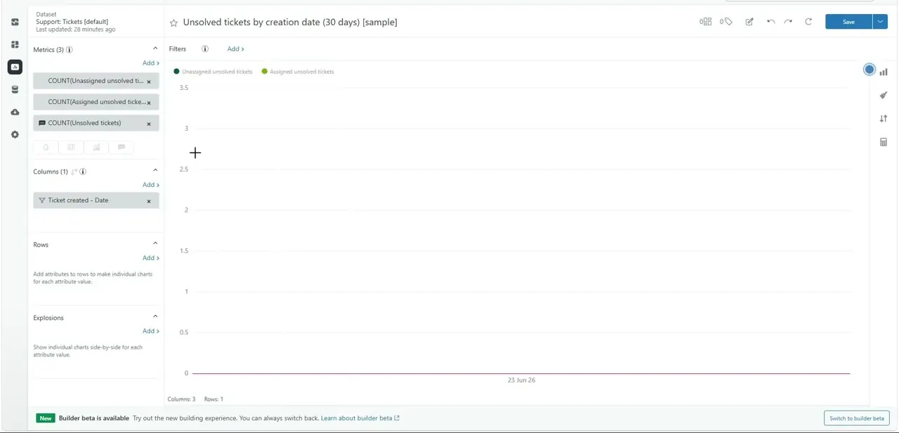
In the left-hand panel, Metrics is where you define what the report is actually counting. It's a small but important distinction: a metric is a number, like COUNT(Unsolved tickets) or COUNT(Assigned unsolved tickets), and you build it by clicking Add under the Metrics heading and picking from the library of standard ticket measures. You can stack more than one metric on the same report — a working example already has three metrics added: unassigned unsolved tickets, assigned unsolved tickets, and total unsolved tickets — which lets you compare related numbers on one chart instead of building three separate reports.
04Slice the metric with columns and rows
Once a metric exists, Columns and Rows are where you decide how to break it apart. Columns commonly holds a date attribute — "Ticket created - Date" in this case — so the chart plots the metric across time instead of showing one flat total.
Rows works the same way for a category, such as assignee name, so you get one line or bar per agent instead of a single combined figure. The report title updates automatically to describe what you've built, for example "Unsolved tickets by creation date (30 days)," which is a useful sanity check that the report matches what you intended to measure.
05Choose a chart type and apply filters
The icon column on the right edge of the builder switches how the same data displays — table, bar chart, line chart, and a few others — without needing to rebuild the metrics or columns underneath. Filters sit along the top of the canvas and are where you narrow the report to a specific window, like the last 30 days, or exclude a channel you don't want counted. Add filters before you save, since a report saved without a date filter will keep pulling in your entire ticket history every time someone opens it.
06Save the report and add it to a dashboard
The Save button in the top-right corner of the builder stores the report to your personal or shared library so it can be reused without rebuilding it. From there, the separate Dashboards section lets you pull multiple saved reports onto one page — pairing your unsolved-tickets trend next to an agent-productivity chart, for instance — so a manager can see everything relevant in a single view instead of clicking through individual reports. Dashboards also support the scheduled email delivery Explore is built around, so the same view can land in a leader's inbox automatically.
Frequently asked questions
What's the difference between a metric and an attribute in Explore?
A metric is what you're counting or measuring, like ticket count, while an attribute — added to Columns or Rows — is how you group or slice that number, like by agent or by date.
Can I schedule reports to be emailed automatically?
Yes, dashboards built from saved Explore reports can be set up for scheduled email delivery so leadership gets recurring updates without opening Zendesk.
Do I need Explore, or does the real-time dashboard cover most needs?
The Real-time monitoring home is enough for live snapshots like current queue size, but anything involving a custom date range, a specific agent, or a saved recurring view needs a report built in Explore.
Can I combine multiple charts into one dashboard?
Yes, the dashboard builder is designed to let you place several saved reports onto a single shared view.
Why does my new report start with a date filter already applied?
Explore templates and sample reports commonly ship with a default date range, like the last 30 days, so the chart isn't empty or overloaded with your full ticket history the moment you open it.
Watch the full walkthrough
The same steps, demonstrated on screen from start to finish.