 Easy Tech Tuts
How to Change Slicer Style in Power BI (Dropdown, Tile & More) Easily 2026
By Impran M N
The way a slicer looks can change how easily people interact with your Power BI report, and the default style Power BI applies when you add one isn't always the right fit for your data or your audience. A slicer with fifty date values is unreadable as a wall of tiles but works fine as a searchable dropdown; a slicer with five product categories is the opposite case, where a dropdown just adds an unnecessary extra click to see options that would fit comfortably on screen at once. This guide covers how to switch between dropdown, vertical list, and other slicer styles directly from the Format pane, using a real report with a date field to show what each style actually looks like in practice and why you'd reach for one over another.
01Start from a report with a slicer-worthy field
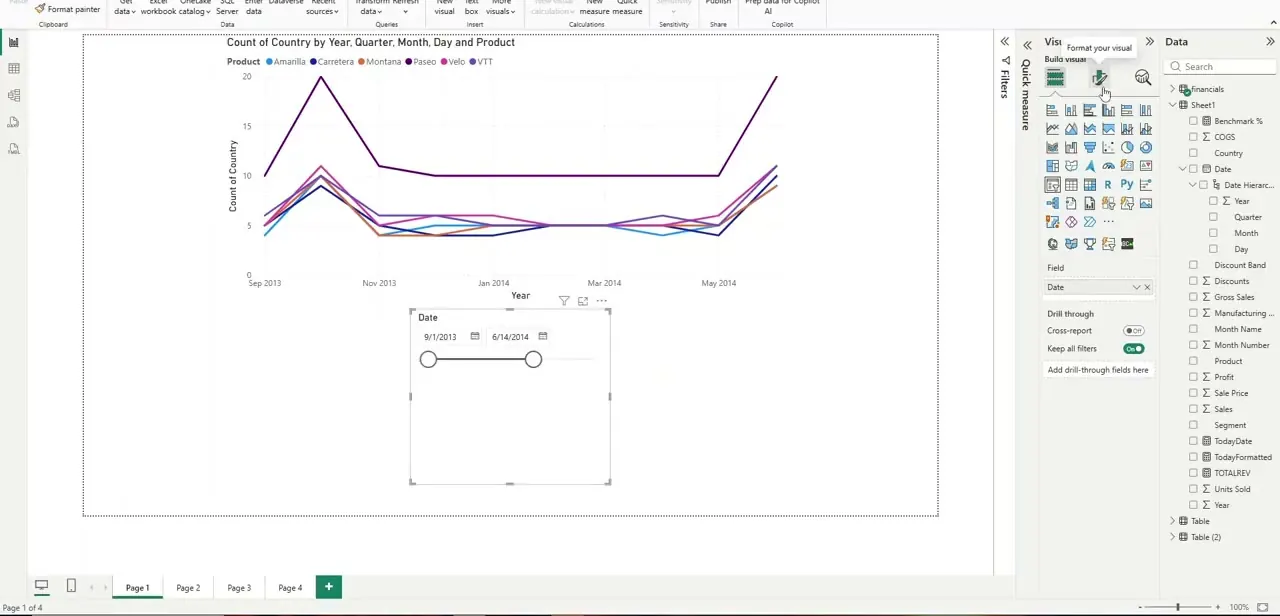
Before formatting a slicer, make sure you've built a chart worth filtering — in this case a line chart tracking a metric across Year, Quarter, Month, and Day, pulled from a Date hierarchy in the data pane. A slicer is only useful when it's actually connected to visuals on the page, so confirm your chart and its fields are in place before you add the filtering control on top of it.
02Add a slicer and confirm its default style
Add a slicer visual bound to your Date field, and Power BI drops it in with a default "Between" style — two draggable handles on a slider, letting viewers pick a start and end point across the range. This default works reasonably well for a continuous range like dates, but it's rarely the final answer once you see how it looks against your specific dataset and page layout.
03Switch to the Dropdown style
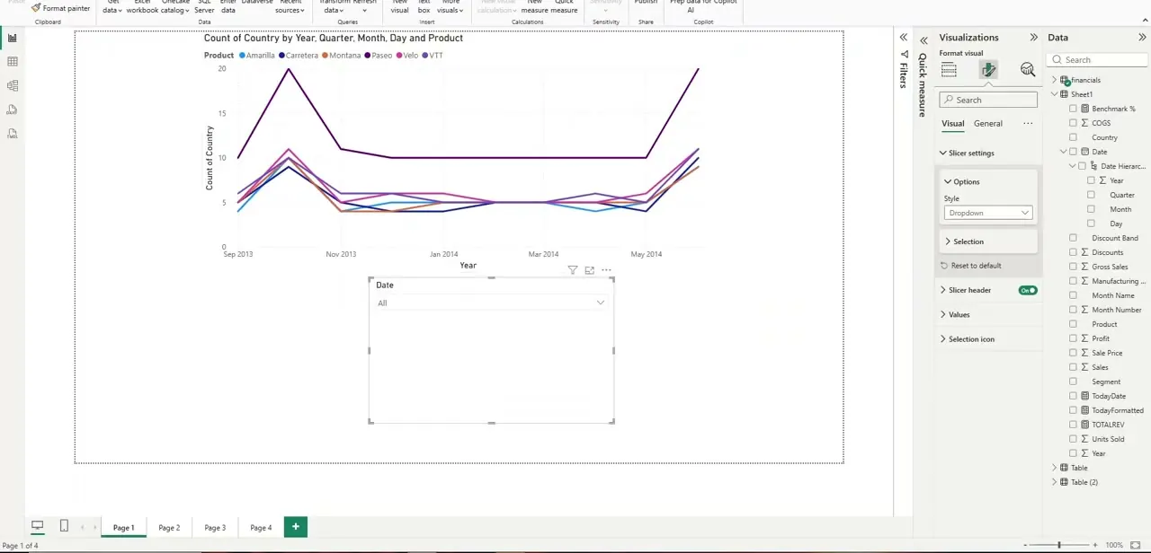
With the slicer selected, open the Format pane, go to Visual, then Slicer settings, then Options, and change the Style field from its default to Dropdown. The slicer collapses into a single compact box labeled with the field name and showing "All" until a viewer clicks it open — this is the style to reach for when a slicer has many possible values and screen space is tight, since it takes up almost no room until someone interacts with it.
04Switch to the Vertical list style
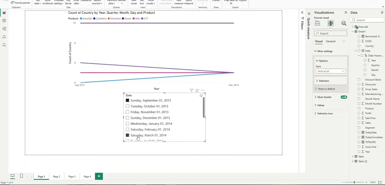
Change the same Style dropdown to Vertical list instead, and the slicer expands to show every individual value as a checkbox row — in this example, each specific date spelled out with its full weekday and month. This style trades compactness for visibility: every option is on screen at once, which suits a shorter list of categories far better than a long list of unique dates, where it quickly becomes a lot of scrolling.
05Match the style to your data volume and audience
As a rule of thumb, dropdown suits long lists and dashboards where space is limited, while vertical list and tile styles suit shorter lists where you want every option visible without an extra click — think five product categories rather than fifty individual customer names. For touchscreen dashboards, favor tile or vertical list styles with larger tap targets over a dropdown, since dropdowns are noticeably fussier to operate with a finger than a mouse, requiring a precise tap to open and another to select. Also consider how often people actually change the filter: a slicer that's set once and rarely touched again can afford to be a compact dropdown, while one people adjust constantly during a live walkthrough benefits from staying visibly expanded.
06Apply consistent styling across your report
Once you've settled on a style that fits a given slicer's data, apply the same choice to equivalent slicers on other pages of the report so the interaction pattern stays predictable for viewers moving between pages. Mixing dropdown slicers on one page with tile slicers on another for essentially the same kind of filter is a common source of confusion — consistency here matters more than which specific style you picked, since a viewer who's learned how the date filter behaves on page one shouldn't have to relearn it on page two.
07Combine styles with other slicer settings for a cleaner report
Style is just one setting inside the Format pane's Slicer settings section — Selection controls whether multiple values can be picked at once or only a single value, and Slicer header lets you hide the field name entirely once the label is obvious from context, freeing up a little more room. Adjusting these alongside style, rather than treating style as the only lever available, is usually what separates a slicer that feels native to the report from one that feels like it was just dropped on and left at its defaults.
Frequently asked questions
Which slicer style is best for a long list of filter options?
The dropdown style generally works better for long lists since it collapses to a single compact box and still lets users search and select options without taking up page space.
Can I change slicer style without affecting the underlying data?
Yes, changing the slicer's visual style in the Format pane only affects its appearance and interaction pattern — it doesn't change the data or filtering logic behind it.
Is the tile slicer style better for touchscreen dashboards?
Yes, tile and vertical list styles tend to work better on touchscreens since the larger, visible options are easier to tap accurately than a dropdown's smaller expand-and-select interaction.
Can I mix different slicer styles on the same report page?
Yes, Power BI allows different slicer styles on the same page depending on what fits each specific filter, though keeping the same style for similar filter types helps the page feel more consistent.
Where exactly do I change a slicer's style in Power BI?
Select the slicer, open the Format pane, go to Visual then Slicer settings then Options, and use the Style dropdown — that single field switches between Between, Dropdown, Vertical list, Tile, and other available layouts.
Watch the full walkthrough
The same steps, demonstrated on screen from start to finish.


